
Introduction:
In the world of Power BI, let’s uncover some small but handy Power BI Hacks that can transform the way you work with data. Whether you are an experienced professional or a beginner, the tips we discuss in this blog will help you streamline your processes and gain insights more efficiently.
Problem Statement:
As the company’s data grows in size, it is essential to spend less time and do smart work by knowing a few data transformation tricks and a few visualization hacks. These tricks are related to Power Query, like how to check the row data details, removal of unwanted columns with ease, searching for specific columns, combining multiple M code steps in a single step, etc.
Example: Suppose you have a sales table that consists of 100 columns, and you want to find the sales date column, and if that column is at the 100th position, you need to scan the complete table manually. But there is a trick for searching a column instead of scanning each and every column, which will be an efficient and quicker process.
So, let’s start discussing those tips which are categorized into Power Query, DAX & Visualizations.
POWER QUERY HACKS
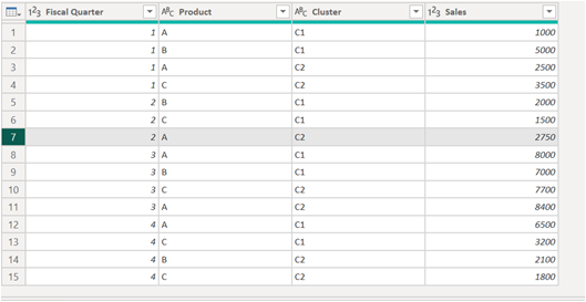
1. Check the Rows
Conceptual Background: Whenever we are working with Power Query, it is very difficult to track the information due to multiple columns and a lot of data. So, instead of tracking the information horizontally, you can simplify your process by clicking on the specific row number. This will help you to display all the data vertically, and this will help you to scan your complete row data without losing your place.
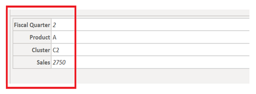
Practical Implementation: In the example below, we have row 7 selected, which displays data vertically in the next image, highlighted as Fiscal Quarter as 2, Product as A, Cluster as C2, and Sales as 2750.
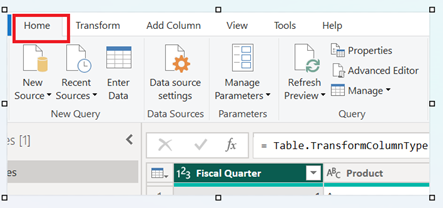
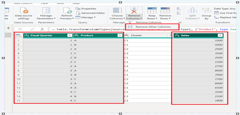
2. Remove Unwanted Columns
Conceptual Background: This is one of the best hacks when working with Power BI. Adding columns consumes extra memory and can slow down the report’s performance. So, you can remove unnecessary columns from your dataset that will lead to faster performance. A leaner dataset is easier to understand, troubleshoot, and navigate.
Practical Implementation: Now, let’s see how to remove unnecessary columns from Power Query:
First, go to the Home Tab ›
Then select Remove Columns ›
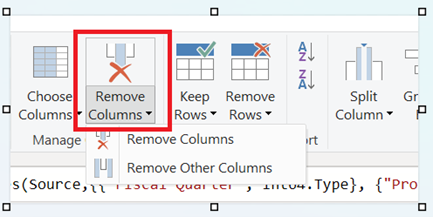
Then select the columns you want to keep and then Remove Other Columns ›
Here, I have chosen Fiscal Quarter, Product & Sales, so by applying Remove Other Columns, the Cluster column will be removed.
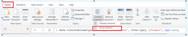
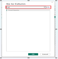
3. Find the Column
Conceptual Background: Searching for a column in a fact table can be frustrating. So, to quickly locate a specific column, use the Ctrl+G shortcut, or you can go to Home › Choose Column › Go to Column. This will open a search dialog box in which we can search for the column name. This shortcut helps save time and eliminates the frustration of searching through the tables.
Practical Implementation:
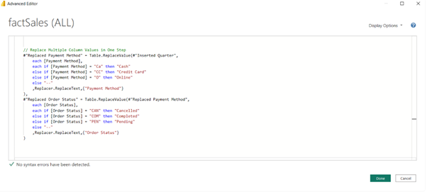
4. Replacing Multiple Column Values in One Step
Conceptual Background: Using a conditional column, we can replace multiple Column values in a single step, which eliminates creating repetitive manual steps. This will reduce the time and effort needed to clean data, ensuring consistency across datasets. This will also improve the performance as there will be no redundant steps.
Practical Implementation:
5. Filtering by Selection
Conceptual Background: Filtering the data in Power Query is a common scenario, so the most efficient way to do it is to select the desired column › right click › and choose the appropriate filter condition.
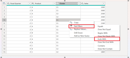
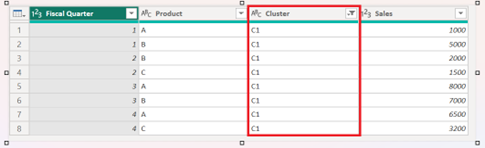
Practical Implementation: For eg, if we want to filter the values that end with C1 in the Cluster column, then right click on C1 › Text Filters › Ends With will filter the cluster column with C1 values.
POWER BI HACKS DAX
6. Formatting DAX Measures
Conceptual Background:
- Use Line Breaks: Shortcut is Alt + Enter
- Practical Implementation: If you want the text to appear like this:
- Sales for Q1: $10,000
- Sales for Q2: $12,500
- Then you need the DAX as below:
- Sales for Q1: $10,000
- [Shift + Enter]
- Sales for Q2: $12,500
- Practical Implementation: If you want the text to appear like this:
- Indentation: Indentation can be done by Tab.
- Practical Implementation:
- IndentedTitle = REPT(” “, 10) & “Total Sales for Q1”
- This adds 10 spaces before the title text, creating a simple indentation effect.
- Practical Implementation:
- Adding Comments: If the DAX measure is too complex, you can add comments for readability. For short comments, you can use /,/, and for a longer comment,t you can start with /* and end with */.
- Practical Implementation:
- Single line comments can be added as below (by using //):
- Total Sales = SUM(Sales[Amount]) // Calculates the total sales for the period
- Multi-Line Comments: Use /* to start the comment and */ to end it. This helps comment out larger blocks of code or for more detailed explanations.
- This measure calculates the total sales, but only for the regions where the sales exceed $10,000 in total. *
Total Sales Over 10K =CALCULATE(
SUM(Sales[Amount]),
Sales[Amount] > 10000
)
- This measure calculates the total sales, but only for the regions where the sales exceed $10,000 in total. *
- Single line comments can be added as below (by using //):
- Practical Implementation:
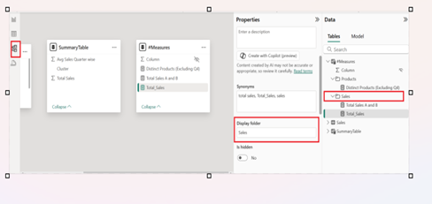
7. Organize Measures in Folders
Conceptual Background: When we are creating measures for reporting purposes, there is a possibility that we can be overwhelmed with a lot of measures; for this, we need to organize them in folders.
Practical Implementation: For organizing measures in folders, we need to go to Model view › select the measure, and type the folder name in Properties view. Once the folder is created, you can easily drag and drop the measures and move them into the respective folders. The good part is that you can allocate a single measure to more than one folder. For the same, you need to add multiple folder names in the Display folder and separate them by a semicolon.
POWER BI HACKS Visualizations
8. Stacking visuals uniformly
Conceptual Background:
Sometimes it gets messy when you have to add multiple visuals to the dashboard. Group formatting options can help us in such situations.
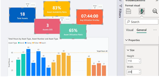
Practical Implementation: For eg, as shown in the image below, all the KPI Cars are placed non-uniformly:
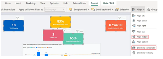
To align these KPI Cards evenly, we need to perform the following steps:
- Select all the KPI Cards › General Properties, › Setup a fixed height & width
- Select the first and last card and move them into opposite corners, and set up the space between all the cards. Now go to Format › Align middle › Distribute horizontally.

9. Locking Objects
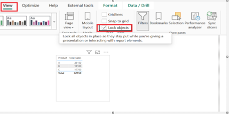
Conceptual Background: While presenting the Power BI reports to the end user, we must lock the objects so there are no accidental alterations.
Practical Implementation: For locking the objects, we need to go to the View Tab à enable lock objects.
10. Padding for Readability
Conceptual Background: To improve the readability of tables in Power BI, padding should be given. Increasing the padding value in the table formatting options provides a more pleasant view, making the table less cluttered and messy.
Performance & Best Practices:
Let’s discuss the basic differences between applying the above tips and tricks and not applying them:
| Feature | Not applying tips | Applying the tips |
| Effectiveness | While simply dragging the fields into visuals is not an effective way of using Power BI. | By using some creative DAX functions, applying comments, etc, you make your reports more interactive, efficient, and dynamic. |
| Automation | Entering the data manually, adjusting visuals manually. | Automating the processes, optimizing performance by using a performance analyzer and removing unwanted columns, auto-refresh schedules, etc. |
| Data Transformation | Basic row filtering and changing data types. | Applying multiple M codes in a single go, parameterizing queries, etc. |
| Design and formatting | Applying normal colors and adjusting visuals manually. | Applying JSON themes, aligning visuals using the FORMAT option by choosing align middle, distribute horizontally, distribute vertically, etc. options. |
| Interactivity | Reports are static with basic insights. | Using bookmarks, drill-through, and conditional formatting makes reports dynamic. |
Conclusion:
These 10 Power BI hacks, ranging from data manipulation in Power Query to aesthetic enhancements in visualizations, are designed to make your data analysis tasks more manageable and efficient. These tips can significantly improve your workflow and data presentation.
-Fatema Rangwala
Advanced Analytics Engineer
References
https://databear.com/9-small-but-highly-useful-power-bi-hacks/
https://goanalyticsbi.com/7-power-bi-hacks-that-wow-clients/
https://datasemantics.co/power-bi-solutions/
https://medium.com/@enridge/five-simple-hacks-in-power-bi-d94b6d0ceede