
Creating a well-structured Power BI dashboard isn’t just about adding visuals—it’s about ensuring clarity, efficiency, and usability. A poorly designed dashboard can overwhelm users, while a well-optimized one can deliver actionable insights at a glance.
Here are 15 essential rules to design the perfect Power BI dashboard, along with practical examples to help you apply them effectively.
-
Design with a Clear Target in Mind:
A great dashboard starts with a clear purpose. Are you building it for executives to monitor KPIs? For sales teams to track performance? Or for operations to manage logistics?
✅ Example: If your dashboard is for executives, focus on high-level KPIs like revenue trends, profit margins, and customer growth rather than granular transaction data.
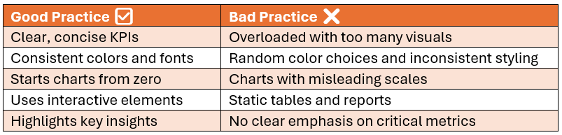
Good vs. Bad Dashboard Practices:
-
Keep Everything at a Glance:
Dashboards should be scannable in seconds. Avoid overloading users with excessive visuals—highlight the most crucial insights.
✅ Example: Use Card visuals for top KPIs (e.g., Total Sales, Profit Margin) and keep filters easily accessible.
-
Keep It Simple:
A dashboard should not require training to understand. Avoid clutter, unnecessary visuals, and excessive colors.
✅ Example: Instead of multiple bar charts, use a single combo chart that combines sales trends with a target line.
-
Align Elements for Better Readability:
Poor alignment creates visual noise. Keep charts, slicers, and text boxes well-arranged.
✅ Example: Use Power BI’s grid alignment and spacing to position elements symmetrically for a structured look.
-
Be Consistent:
Maintain uniform fonts, colors, and chart styles across your dashboard to ensure professionalism and clarity.
✅ Example: Use the same shade of blue for all sales-related visuals and the same font type for labels and headers.
-
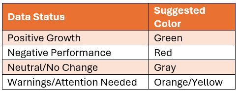
Highlight Key Information:
Users should immediately recognize what’s important. Use color coding, bold fonts, or conditional formatting to emphasize insights.
✅ Example: Apply red indicators to highlight negative sales growth and green indicators for positive trends.
Color Coding Guide for KPIs:
-
Keep Text Clear and Concise:
Too much text can clutter a dashboard. Use short, precise labels and descriptions.
✅ Example: Instead of writing “Total Sales for Q1 2024”, just use “Q1 Sales ($)” in the card visual.
-
Always Start from Zero:
For accurate comparison, bar and column charts should always start from zero.
✅ Example: A bar chart showing revenue should start from $0 instead of $50K to avoid misrepresentation of trends.
-
Shorten Large Numbers:
Avoid overwhelming users with large numbers. Display values in a compact and readable format.
✅ Example: Instead of showing 1,250,000 as revenue, display it as $1.25M.
-
Provide Context for the Data:
Numbers without context can be misleading. Always compare data with previous periods, targets, or benchmarks.
✅ Example: Instead of showing “Revenue = $5M”, add context: “Revenue ($5M) – Up 10% YoY”.
-
Choose Colors Wisely:
Use colors strategically to enhance readability, not just for decoration. Stick to a limited color palette and avoid unnecessary brightness.
✅ Example: Use blue for positive trends, red for negative trends, and grey for neutral elements.
-
Design Dashboards, Not Reports:
Dashboards should be interactive and focused on insights rather than acting as static reports.
✅ Example: Instead of a static table, use interactive slicers and drill-through pages to explore detailed data.
-
Show Data Variations:
Users should be able to spot trends and changes easily. Line charts, year-over-year comparisons, and conditional formatting can help.
✅ Example: Instead of showing just monthly sales, add a YoY % change indicator to visualize performance.
-
Remove Noise & Avoid Unnecessary Elements:
Too many visuals, unnecessary gridlines, and excessive labels distract from insights. Remove anything that doesn’t add value.
✅ Example: Turn off gridlines, axis titles, and extra labels when they are not necessary.
-
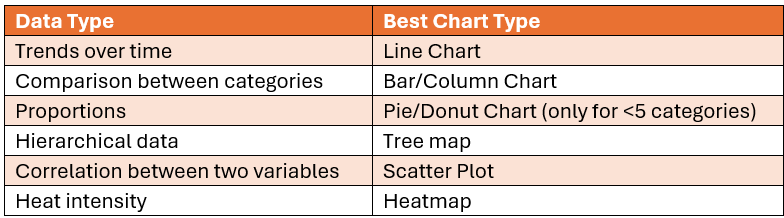
Pick the Right Chart Type:
Not all data fits in a bar chart. Choose visuals that best represent your data.
✅ Example:
Best Chart Type for Different Data Scenarios:
Final Thoughts:
By following these 15 essential rules, you can design Power BI dashboards that are clear, actionable, and user-friendly. A great dashboard is not just about aesthetics but also about usability and efficiency.