The Digital Fatigue is Real. Raise your hand if this sounds familiar: You open an app just to check one thing, and suddenly you’re bombarded with:
- A pop-up survey
- A flashy promo banner
- Three different notification badges
- An auto-playing video
No wonder we’re all feeling digitally exhausted. But here’s the good news – a design revolution is brewing, and it’s all about giving our overwhelmed brains a much-needed break.
Minimalism 2.0: Design That Respects You
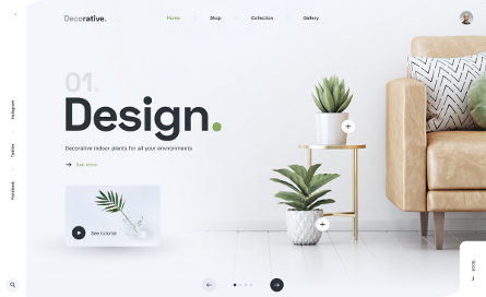
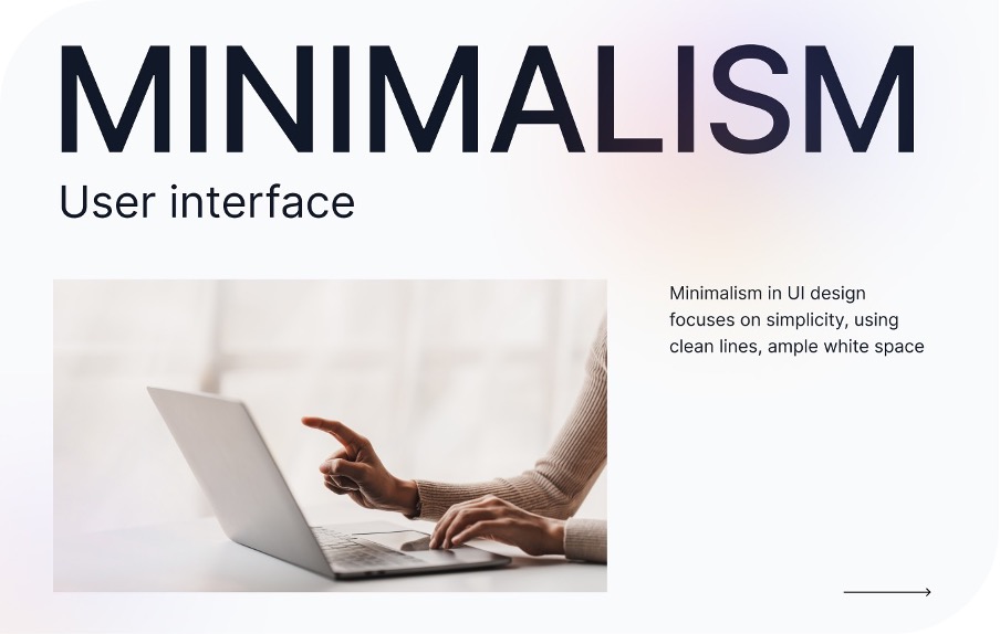
Remember when minimalist design just meant “lots of white space”? In 2025, it’s evolved into something much more powerful – digital experiences that feel like they were designed by someone who understands human psychology.
What Makes Modern Minimalism Work
✅ Intuitive layouts that work the way your brain expects
✅ Purposeful color palettes chosen for calm, not chaos
✅ Smart defaults that reduce decision fatigue
✅ Progressive disclosure that only shows what’s needed when it’s needed. The ease of scaling. The best part? When done right, you don’t even notice the design – you just effortlessly accomplish what you came to do.

The Rise of “Quiet Tech”
There’s a new design philosophy emerging that takes minimalism even further. I like to call it “quiet tech” – digital products that feel more like a helpful butler than a pushy salesperson.
Signs You’ve Found Quiet Tech
🔇 No jarring notifications
🔇 No confusing menus
🔇 No dark patterns tricking you into things
🔇 Just clean, respectful interactions
Some of my favourite examples
- Bear Notes(the writing app that stays beautifully out of your way)
- Oura Ring(health tracking that doesn’t constantly nag you)
- Superhuman(email that reduces stress)

Why This Matters for Your Business
Still not convinced that simple design is worth the investment? Consider this:
- Reduced cognitive load = happier users
- Clean interfaces = higher conversion rates
- Thoughtful experiences = better brand perception
The data backs this up, too. Companies that embraced simplicity early (like Apple and Airbnb) didn’t just win design awards – they won customer loyalty.
How to Start Simplifying Your Digital Presence
Ready to join the quiet revolution? Here’s where to begin:
-
Conduct a “Stress Test”
Use your product when you’re tired, frustrated, or rushed. Where do you get stuck?
-
Implement the “30% Rule.”
Challenge your team to remove 30% of the elements on key screens. You’ll be amazed at what isn’t actually needed.
-
Design for “Micro-Moments”
How does your product feel when someone just has 15 seconds to spare?
-
Measure What Matters
Track frustration metrics (like rage clicks or undo actions), not just conversions.

Conclusion:
As digital noise overwhelms us, minimalist and quiet UI have become essential, not just stylish. This shift goes beyond aesthetics, focusing on reducing cognitive load while enhancing usability. In 2025, the most successful designs will prioritize clarity over clutter, creating interfaces that feel like thoughtful partners rather than demanding tools. The future belongs to technology that serves quietly, proving that less isn’t just more—it’s better.
In 2025, the most successful digital products won’t be the ones with the most features – they’ll be the ones that make people feel calm, capable, and in control.
As designer Dieter Rams famously said, “Good design is as little design as possible.” Turns out he was right all along.
